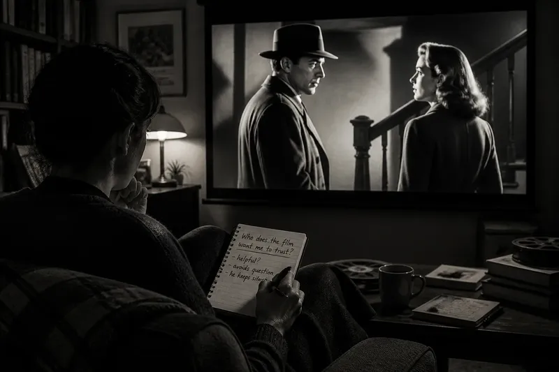
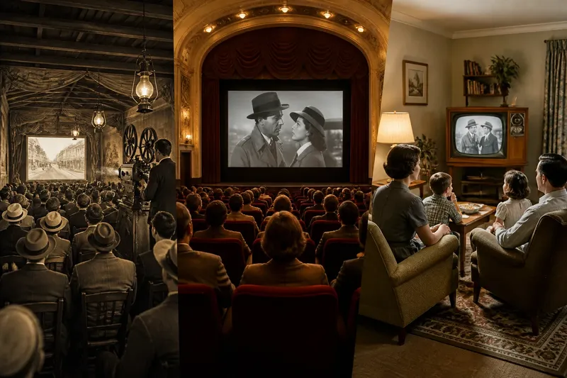
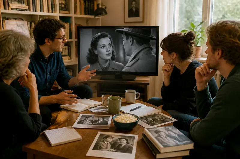
Black and White or Colour: Choosing a Version of a Classic Film
Black and white or colour viewing can shift your attention in a classic film. Choose a presentation that helps you follow the details you care about.
Black and white or colour viewing can change how a classic film directs your attention, even when the scene itself is unchanged. A monochrome image may make a silhouette stand out; a colour image may draw your eye to a costume that repeats across the frame. Choose by asking what you want to follow, then check whether the presentation actually makes it easier to see.
Films can circulate in different presentations, including monochrome versions of films originally released in colour. Rather than treating the choice as a verdict on which version is correct, use it to notice how visual information is organised. A useful comparison starts with a specific detail and follows what happens to it.
What does black and white or colour make easier to see?
Black and white turns hue into shades of grey. A pale collar against a dark coat may become conspicuous, while a patterned fabric can merge into a single tone. It also brings attention to changes in brightness: the shine on a table, a face near a window, or a figure separated from a crowd by shadow.
Colour adds relationships between hues. A red sign can pull attention from a blue-grey street; a costume may blend with its setting or stand apart from it. The extra information is not automatically clearer. Colour can make a composition feel busy, while monochrome can erase distinctions that depend on hue.
Notice the first detail you follow, then ask what drew your eye to it. That gives you a starting point for comparing the images without rating them.
How does monochrome change the way light reads?
In a monochrome presentation, shifts from light to dark carry much of the image’s descriptive work. Highlights can reveal a polished surface, while smoke or mist may soften the space between figures. Closely related grey tones can create a gentle image; sharper contrasts can make a doorway or face stand out.
Look for what becomes distinct and what disappears. A hand against a sleeve might be easy to trace, while a dark patterned wall may flatten into a single area. Describe the visible relationship rather than calling the image “more artistic”: a bright window makes the room feel exposed, or a shadowed doorway frames a pale figure.
What is colour doing in the composition?
Ask what colours connect and what they separate. A repeated hue can link objects across a scene; a costume that clashes with its setting can make a character look conspicuous. These are observations about the frame, not proof that a colour carries a particular symbol.
Start with where a hue appears, what sits beside it and whether it returns. Only then consider whether the pattern supports an interpretation. A green wall, for instance, may be a design choice rather than a coded message.
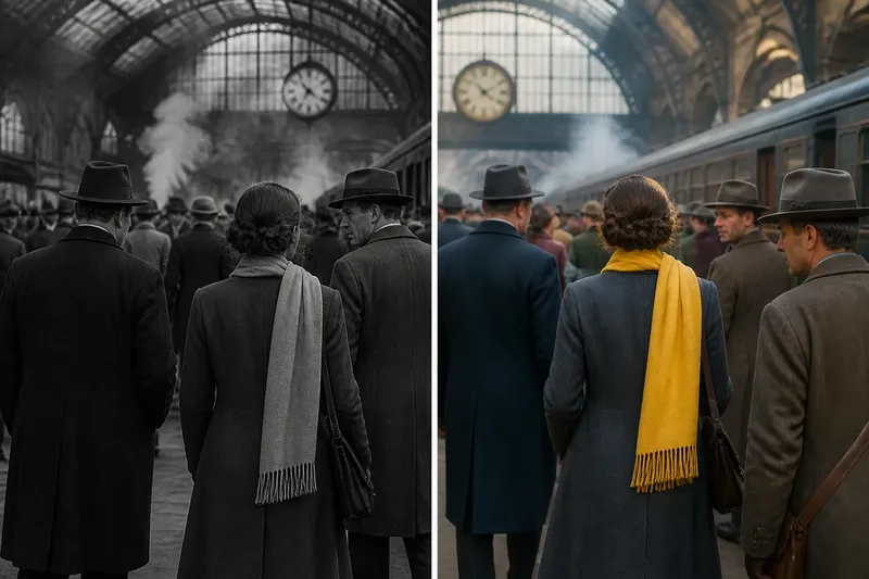
Say you are comparing two presentations of a busy station scene. In the colour version, a yellow scarf remains visible as its wearer moves behind passengers; in monochrome, the scarf’s outline is easy to trace but its hue no longer separates it from nearby clothing. Following the scarf in each version tells you whether colour contrast or silhouette makes the movement clearer to you.
What should you check before choosing a version?
A version’s availability does not explain its history. A monochrome presentation of a film first released in colour may be a later adaptation or alternate presentation; colour versions can also reflect restoration and transfer choices. Framing, contrast and colour treatment may vary, so neither format is automatically untouched.
If the history matters, read the edition notes from its distributor or archive and identify which presentation you are watching. If you are choosing for a first viewing, it is also reasonable to prioritise a clear, comfortable image and leave the historical question open.
- Check the edition notes: if they identify the presentation and its background, use that information when discussing its history; if they do not, describe what you watched without claiming it matches an earlier release.
- Check whether the scene’s important detail is separated by hue: if it is, choose colour to follow that distinction; if not, try monochrome and see whether tonal contrast makes the detail clearer.
- Check whether foreground and background merge: if they do, choose the presentation that separates them more clearly; if both remain crowded, follow a single figure or object instead.
- Check whether a costume blends into its setting: if it does in one version but stands apart in the other, choose the version that suits your question about character and place; if the difference is slight, do not make it the deciding factor.
- Check whether light and shadow guide your attention: if they do, choose the presentation where those changes are easiest to trace; if colour distracts from them, try monochrome.
- Check whether repeated colours link objects across the scene: if they do, choose colour to follow that pattern; if they do not, compare silhouettes or movement instead.
- Check whether the image feels comfortable to watch: if one presentation makes you strain or lose track of the action, choose the clearer alternative; if both are comfortable, decide by the visual detail you want to follow.
How can you compare the two presentations?
Keep the comparison tied to one scene rather than trying to judge an entire film at once. Choose a moment with several visual layers, such as a face against a patterned wall, a group crossing a doorway, or a character handling an object. Watch the scene in one presentation, then return to the same moment in the other.
Say you have the station scene and want to know whether a character’s route through the crowd is easy to follow. First, note where the yellow scarf appears in the colour presentation. Next, watch the same action in monochrome and follow the scarf’s outline rather than its hue. If the outline stays visible, monochrome may make the movement legible; if it disappears among similar tones, colour may better serve that particular question. The comparison does not settle which version is superior; it shows which visual cue helps you follow the action.
What do viewers ask about black and white or colour?
Is a black-and-white version more authentic?
Not necessarily. A film may have been made for monochrome, adapted later, or presented in versions with different alterations. Check the edition notes before making a claim about its history.
Does colour always reveal more detail?
No. Hue can distinguish objects, while tonal contrast can clarify edges or patterns. Compare the particular detail you want to follow rather than assuming one presentation contains more useful information.
Can I enjoy both versions without choosing a favourite?
Yes. One presentation may make a costume easier to track, while another clarifies a shadow or silhouette. You can value each for a different visual emphasis without ranking them.
What if the colour looks distracting?
Check whether a repeated colour pattern is drawing attention for a reason, or whether it is obscuring the action you want to follow. If the image remains uncomfortable or hard to read, try the other presentation.
Which viewing habit fits this film?
Choose black and white or colour by naming the detail you want to follow, then selecting the presentation that makes it clearest. On a revisit, switch only if the alternative offers a different cue to watch: a hue that links objects, a shadow that frames a face, or an outline that carries movement through a crowd. Naming the version and the detail keeps your observation useful to anyone watching or discussing the film with you.